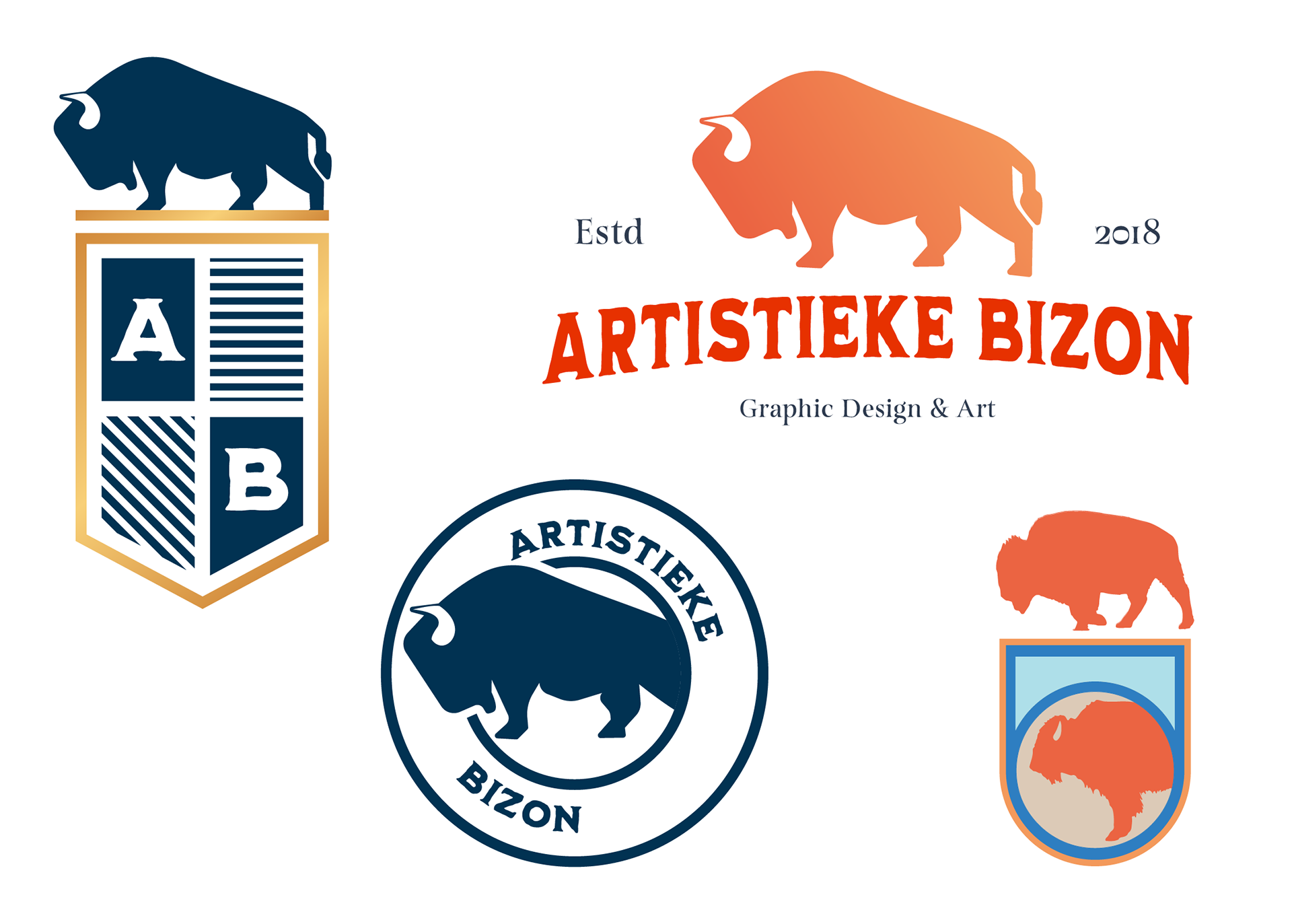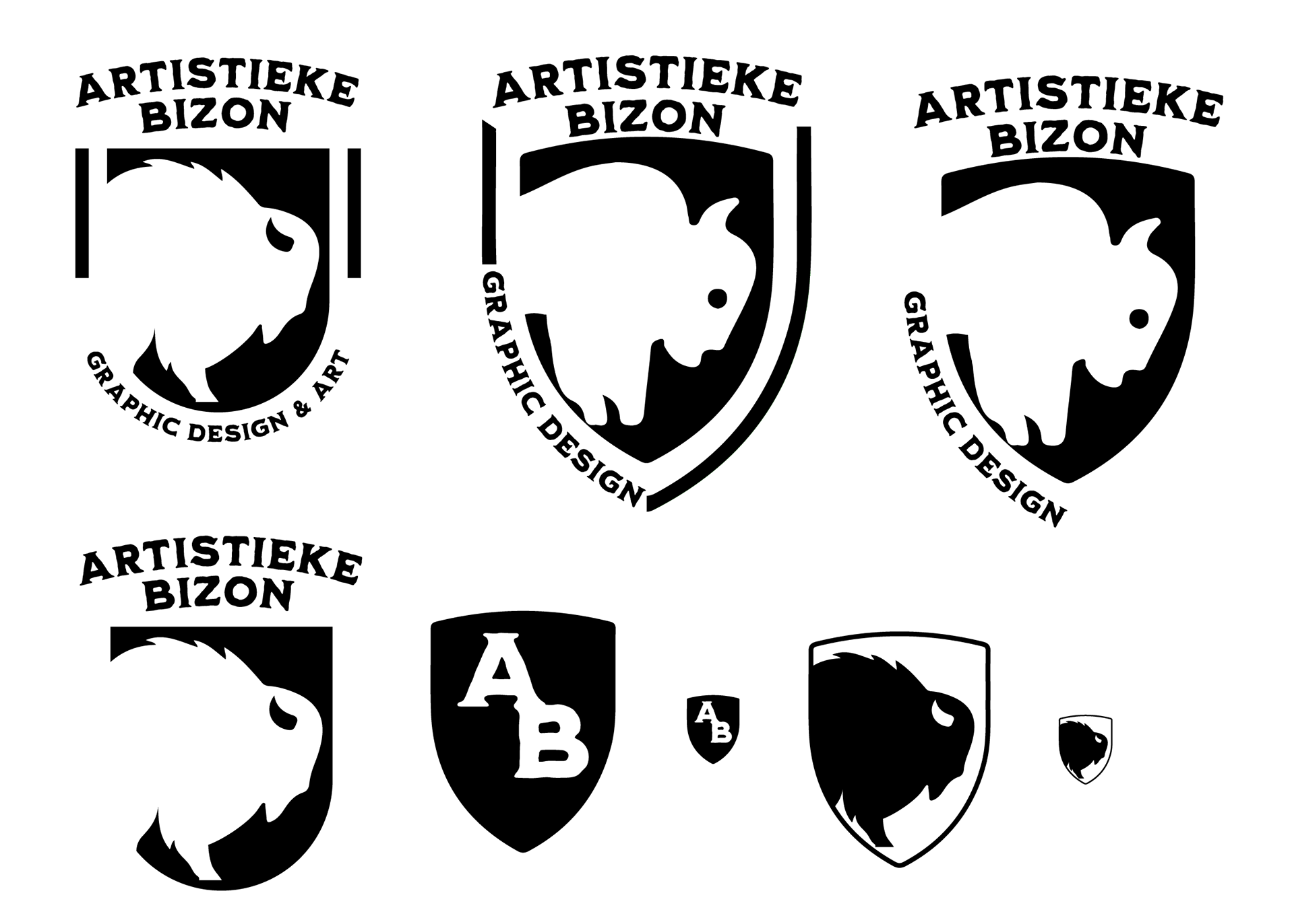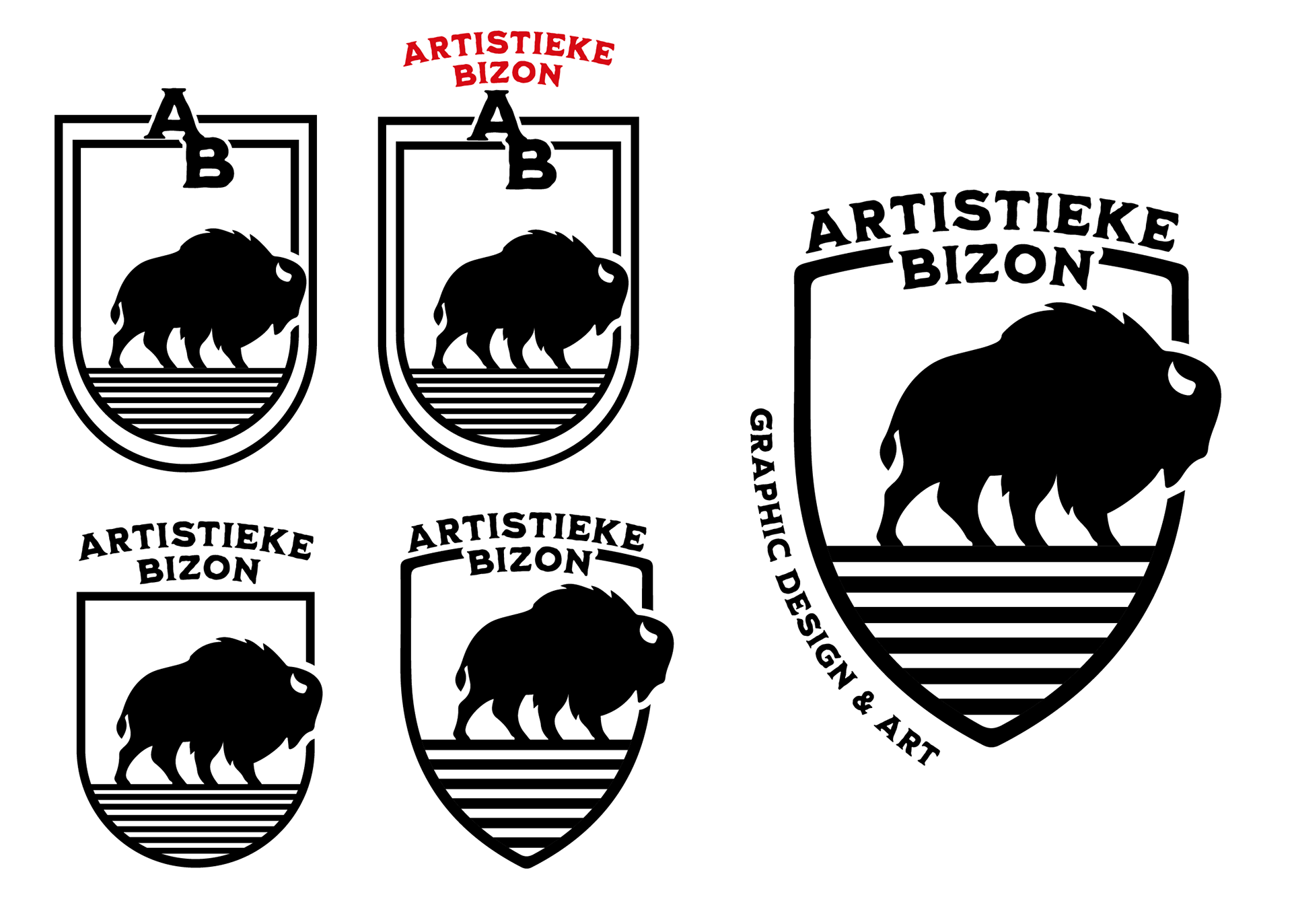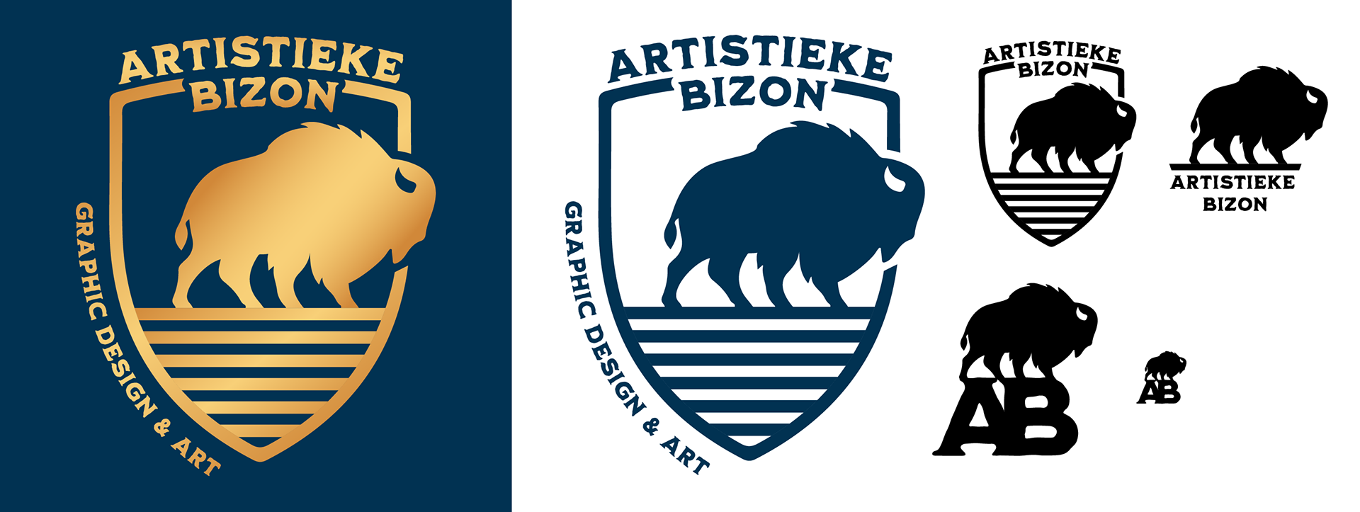
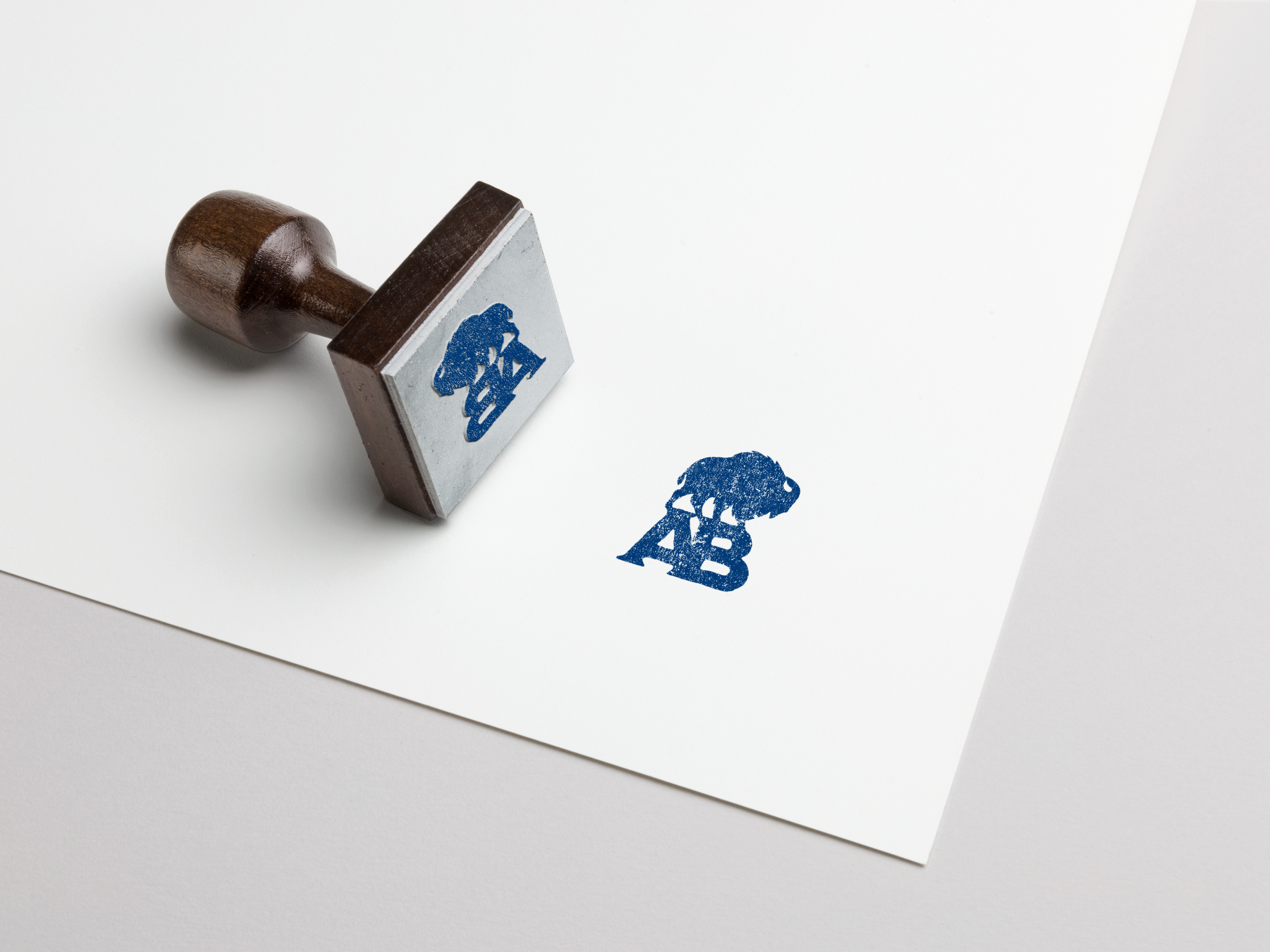
I decided to update my own logo. It was, long ago, the first logo I ever made. The first thing I wanted to do was to make the bison graphically stronger.
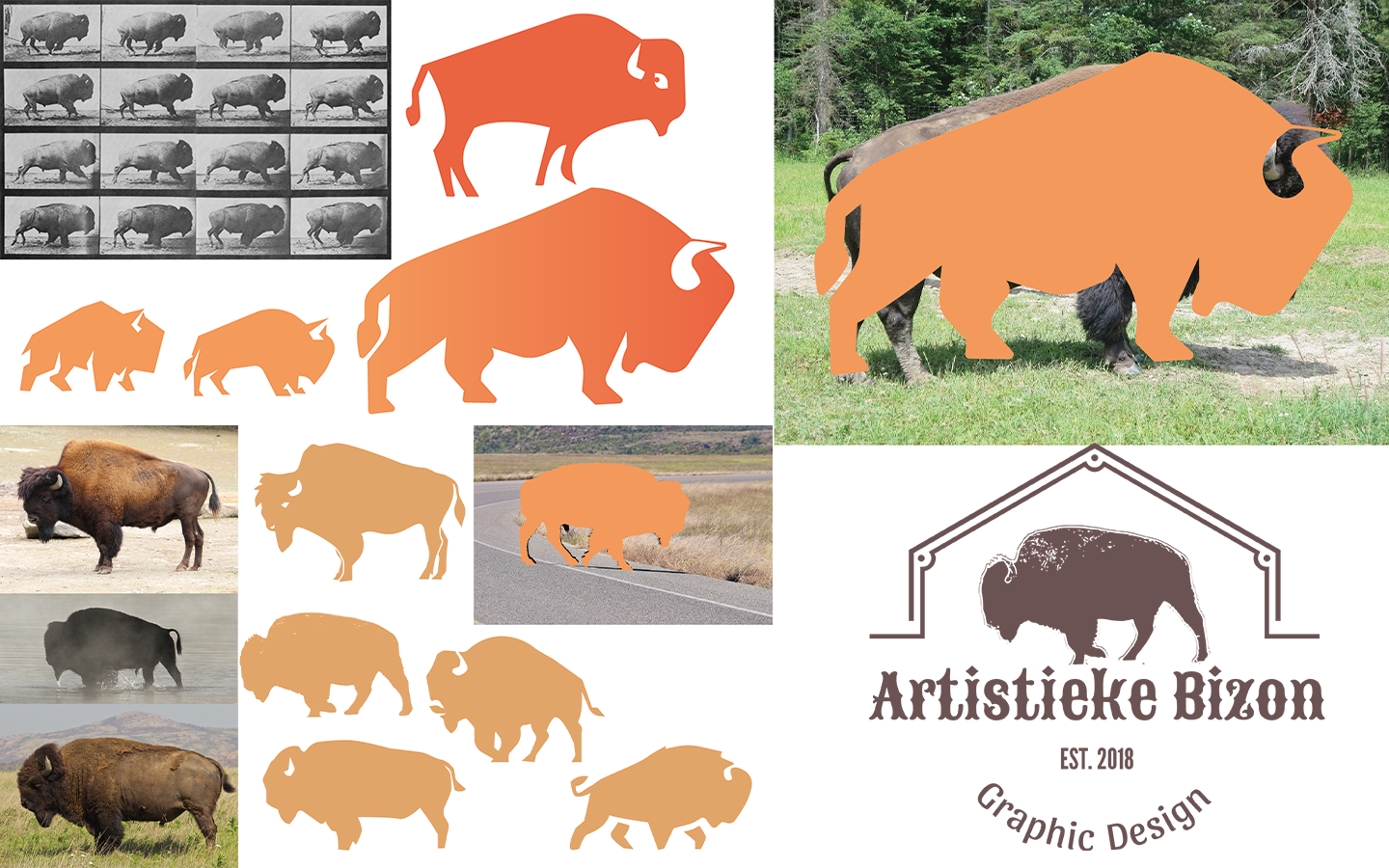
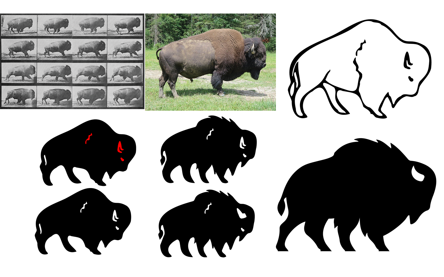
Like last time, my main starting point was Eadweard Muybridge's photographs, his American bison cantering. This is an excellent starting point as it shows a bison in motion.
I used photos from zoo visits and online photos so that I had an anatomical view from different angles. I used pen and paper, black marker and paint to draft the first bison. Then I used Adobe Capture so I could digitally work on the drawings to make it a graphically strong icon.
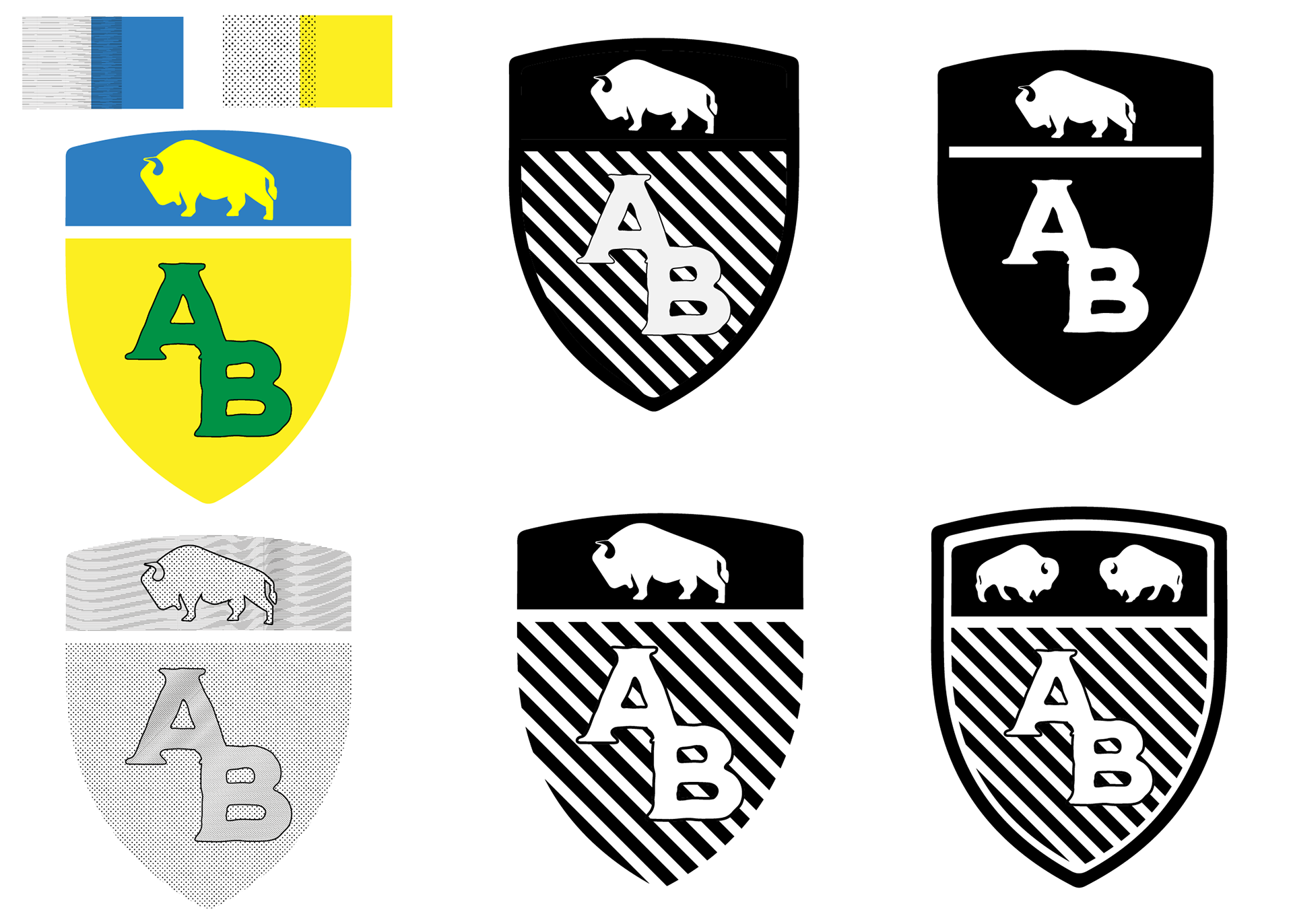
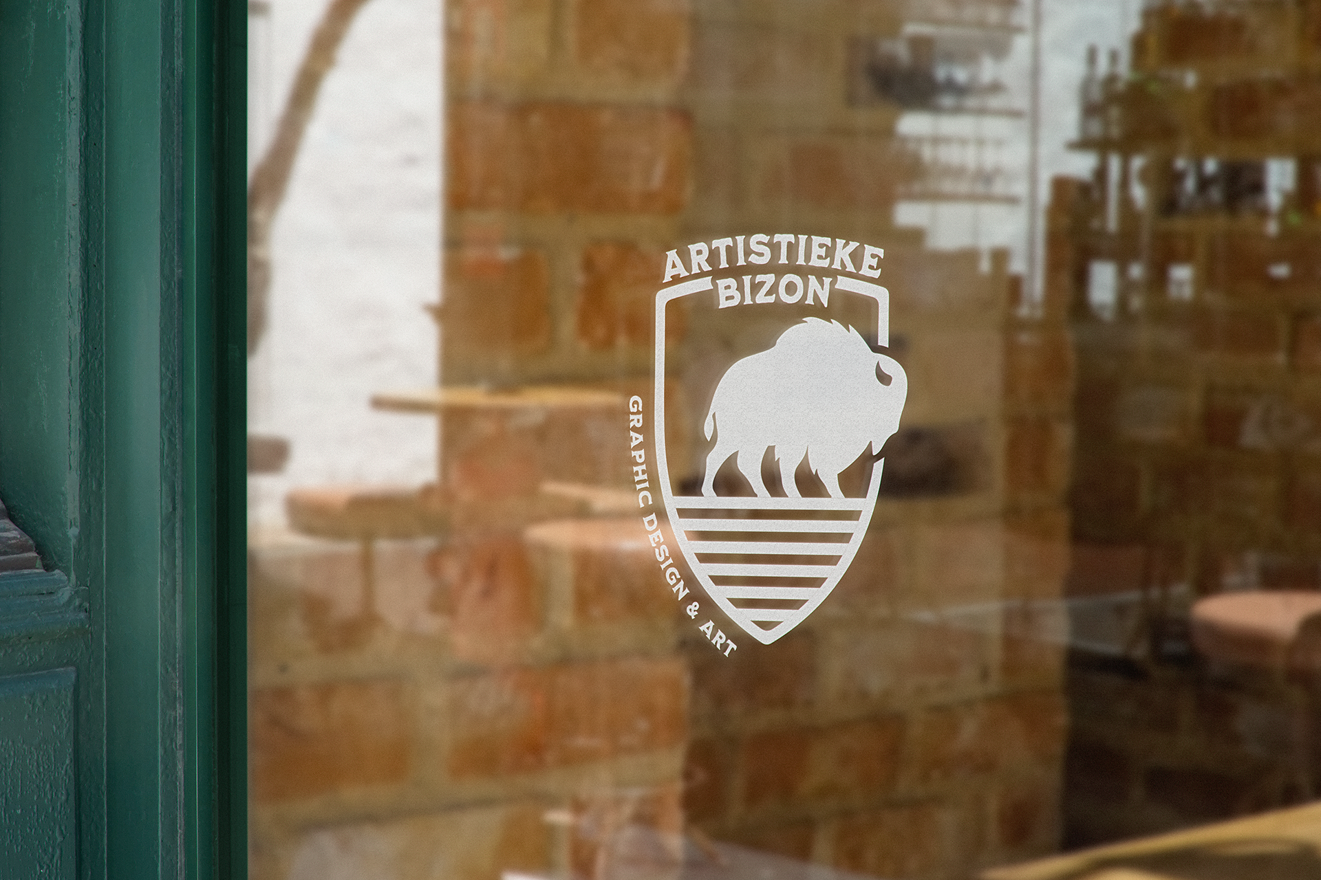
After some first ideas I returned to an old love: heraldry, to make a coat of arms. With the bison as crest? Or as supporter? Or on the shield? It had to be a modern looking coat of arms with authentic elements. I reread a book about heraldry and first I thought to use the tincture with its monochromatic designations, the hatching. But the colors I wanted didn't give a good result. When the shield was done I created a badge.
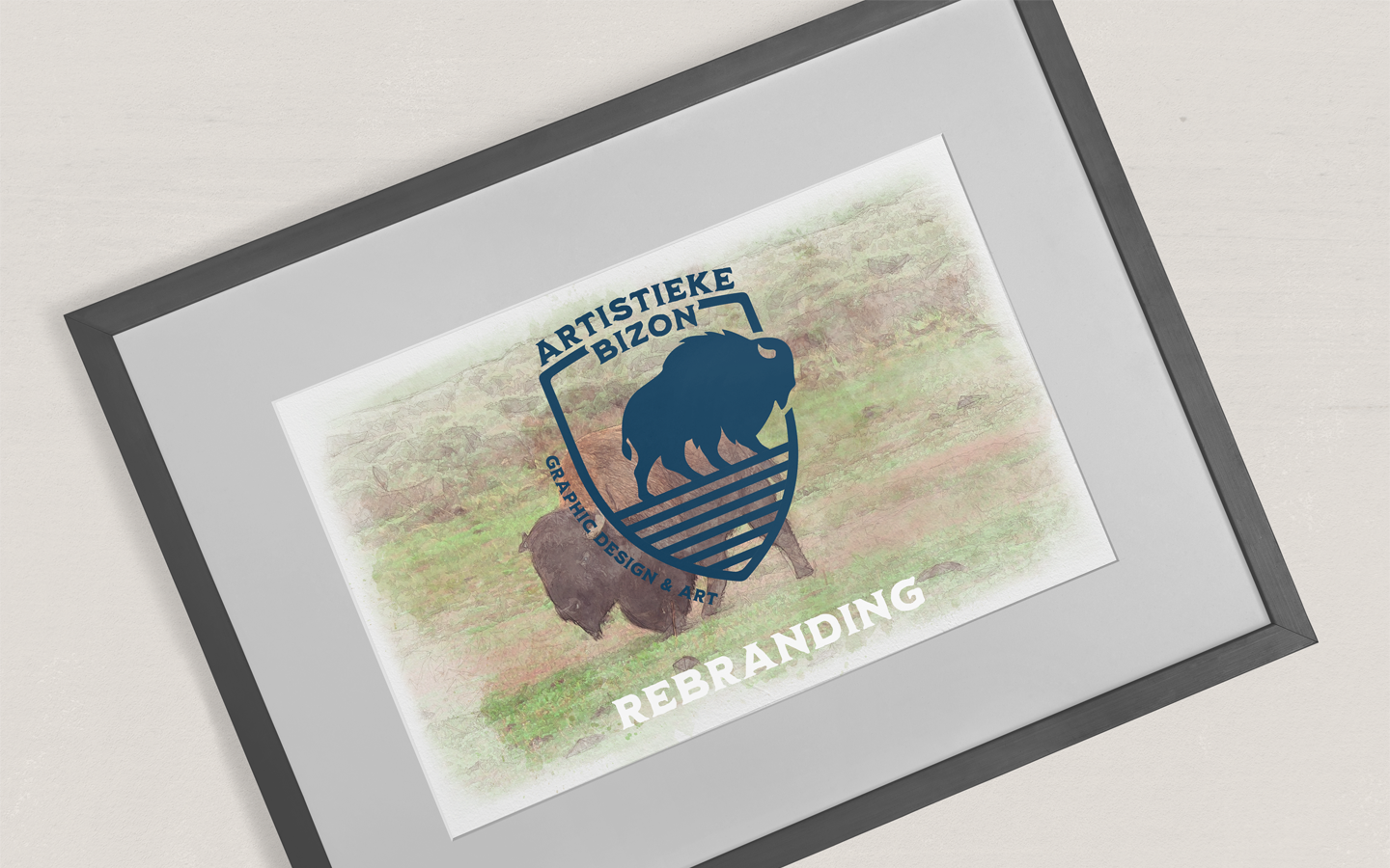
The Process: